Águia Sistemas (Eagle Systems) manufactures industrial conveyor systems in Brazil, with an international client base. Their brief: a way to demonstrate how their factory logistics solutions work across seven distinct areas of a factory floor, deployable at trade shows worldwide. Five minutes with the exhibit, and a prospect should walk away understanding the system.
The solution was a 2.1m × 1.4m physical architectural scale model of a factory, built to travel from Águia’s São Paulo headquarters to conference halls around the world. Visitors put on Meta Quest 3 headsets and see a full mixed reality overlay tracked to the model — station buttons around the perimeter, animated 3D factory sections, bilingual narrated content panels, and Águia’s brand identity rendered spatially throughout. No onboarding. Pick up the headset, look at the table, start exploring.
As Exhibit Designer, I was responsible for the spatial design of the virtual overlay, brand adherence, and visual asset design and production. I worked alongside a technical art director, a developer, and a 3D artist.
The Design Problem
The original concept placed a flat information panel floating above the center of the table. Two problems: it competed directly with the 3D factory model for the same visual real estate, and it treated the space above the table like a screen—stacking content vertically instead of using the three-dimensional environment the headset makes available.
The table sits at 82cm, with users standing around it and able to move freely. The architectural model spans over two meters. Designing for it meant thinking in three dimensions, not two.
Spatial Hierarchy
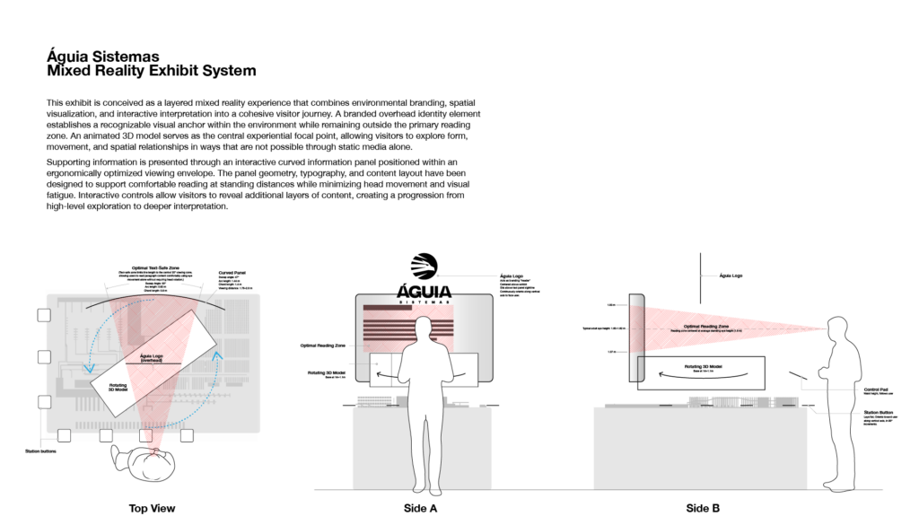
The first change I proposed was relocating the information panel off the table surface entirely — pushed to the far side of the model from wherever the user is standing, at approximately eye level. This cleared the vertical space above the model for the 3D factory section to occupy, rotating slowly on the table’s central axis so users can inspect it from all sides. The Águia logo anchors the upper volume, overhead and unobstructed. Station buttons ring the perimeter.
The result is a legible three-level spatial hierarchy: buttons and model at table level, activated content in the mid-volume above, branding overhead. Each layer has a distinct location.
Curved Info Panel
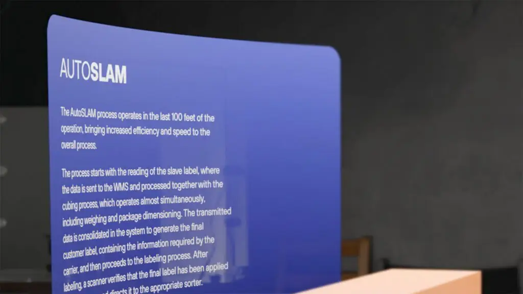
With the panel moved to eye level at distance, flat geometry no longer made sense. A flat panel wide enough to hold the content would place its edges farther from the user’s eyes than its center, creating uneven reading distances and optical distortion at the periphery.
I specified a curved panel, with the curvature radius derived from the typical standing distance between a user and that far edge of the table. The curve keeps every point on the panel surface equidistant from the user’s eyes — the same principle behind curved cinema screens and panoramic museum display cases. Panel width was set by the comfortable limits of the Quest 3’s field of view. Line measure was calculated from the panel’s distance and the body text size required for legibility at that distance. These are the same ergonomic calculations that go into designing signage for a gallery or an interpretive panel along a museum trail.
Station Buttons
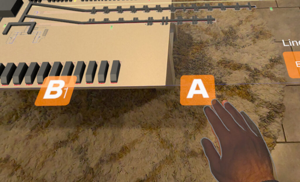
Seven stations, seven buttons around the perimeter of the model. Each button is approximately palm-sized, with an active zone sized to account for the slight imprecision of hand tracking in MR.
The buttons use letters rather than numbers. Numbers imply sequence; this exhibit has none. A visitor should feel free to walk to whichever station interests them first, and the labeling system should communicate that.
Each button uses a layered design — a brand-color background with a letter floating slightly above it, creating a parallax depth effect as the user shifts their angle. As the user moves around the table, the letters rotate in 90-degree increments to always face them. In a physical exhibit, a label facing away from a visitor is a failure of environmental design. The virtual labels needed the same spatial awareness.
Wayfinding and Language Switching
The language toggle — English (EN) / Portuguese (PT) — lives as a pair of virtual buttons in the near-right corner of the table from the user’s current position. As the user walks around the model, the language buttons reposition to maintain that near-right relationship. The active language is indicated by a label above the buttons: “Language” in English, “Linguagem” in Portuguese.
This is wayfinding logic applied spatially. The buttons don’t live at a fixed coordinate in the room — they follow the user’s frame of reference, the way a well-designed information kiosk is oriented toward the primary approach path regardless of which side of the room you’re coming from.
The Control Pad
When a user activates a station, a control pad appears at approximately waist height directly in front of them, surfacing three controls: toggle voiceover narration, switch between the 3D model view and a photo/video gallery, and close the station. Waist height keeps it within peripheral reach without pulling attention away from the table and panel.
The controls were deliberately kept to a minimum. The typical visitor has never used this exhibit before and may only have a few minutes. Every additional control is a decision, and a potential point of confusion.
Brand Implementation
Before any design work, I did a thorough review of Águia’s brand guidelines — color palette, typography, image treatment, graphic language. Panel typography uses their brand typefaces. Button and panel colors are drawn from their palette. Logo placement follows their standards for environmental applications. A prospect who picks up the headset after seeing Águia’s booth graphics needed to recognize the same brand.
Testing and Iteration
All testing used multiple users with Meta Quest 3 headsets. Because the physical model was being fabricated in Brazil concurrently with our virtual development, we built and calibrated the entire spatial experience against a CAD file of the model rather than the physical artifact.
Testing covered panel text readability at distance, button accessibility at varying user heights, sight lines to the 3D models (which vary in height across the seven stations), and navigability for first-time users. The 3D models were scaled to remain visible above the architectural model without obscuring the text panel or intersecting the logo overhead.
Exhibition Design, Virtually
Designing a virtual spatial environment for a headset-based exhibit raises the same questions as designing a physical gallery: Where does the user’s eye go first? How does content hierarchy work when the viewer can move? What makes a label readable at distance? How do you build navigation for someone who’s never been here before and has five minutes?
The medium differs from a physical museum installation, but the design problems don’t. The Águia exhibit needed to work for visitors of varying heights and languages, in conference halls around the world, with no shared context between visitor and exhibitor. That’s an exhibition design problem, and it was solved with exhibition design thinking.